Alistair Stiegmann
For our inaugural VERO Team profile, we sat down with VERO Creative Director (and 2nd Degree Black Belt in Tae Kwon Do) Alistair M. Stiegmann to learn more about VERO's approach to product and brand design.

What does it say on your business card?
Alistair M. Stiegmann. Creative Director at Vero Labs, Inc.
I lead the product and brand design of VERO™ — True Social.
Where is home?
I grew up in Virginia Beach, VA. A beach town on the east coast of the USA. I went to Princesse Anne High School with Pharrell Williams (he was a couple years older than me, so didn’t really know him, just listened to his raps in the cafeteria :)
Home is Nice, France. I came to the south of France in 2001, with Stephanie (now my wife) whom I met in San Francisco during the dot com bust. It took a few years to adapt to the French culture, learn the language and integrate. Today, I feel at home and wouldn’t want to live anywhere else. Great memories and a one of a kind mediterranean lifestyle (which I highly appreciate).
Can you explain the design philosophy behind VERO?
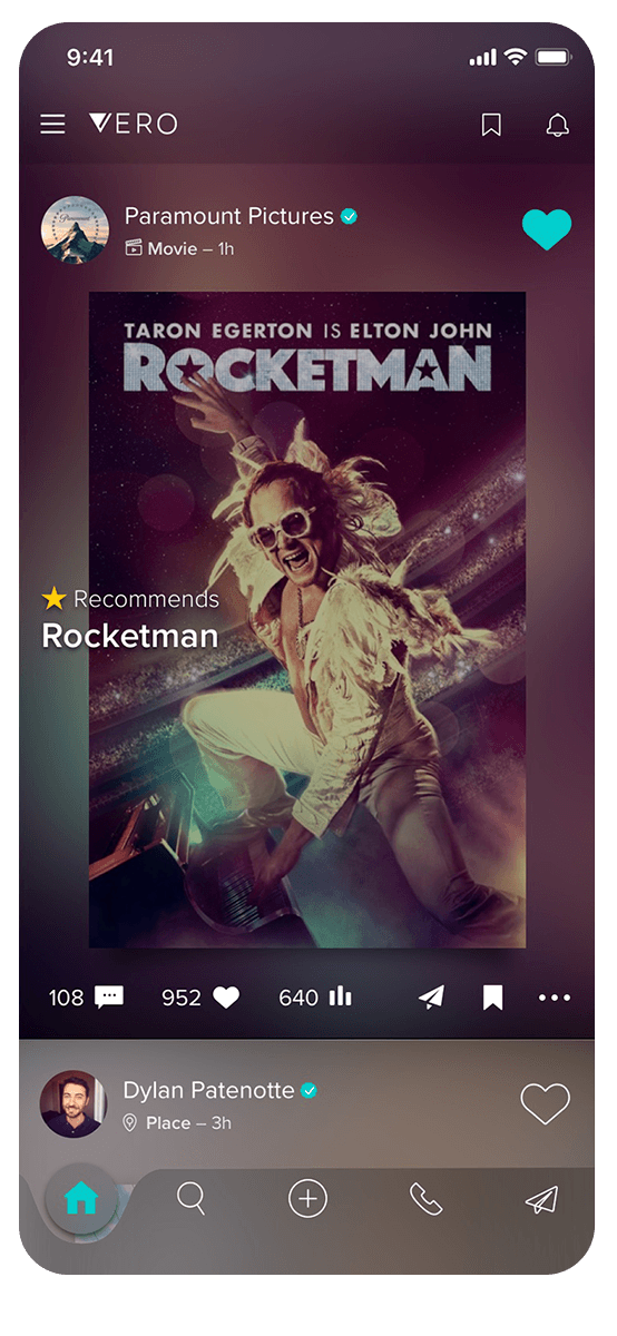
Fundamentally, VERO's design philosophy is to get out of the way. People use social media to stay connected with friends or to discover new content, trends and perspectives, but many social networks make it difficult to fully immerse yourself in the content you want. The apps themselves aren't always visually appealing, there are ads everywhere in your feed, and it seems like many design choices made by the big social networks seem to prioritize a quick snapshot view over really looking at something.
With VERO we've attempted to combine timeless principles of art direction and typography from the world of print design and magazines with the best practice UI/UX design to offer more of a gallery experience in-app. We're always thinking about how to give creators a better canvas for their work, whether that's by automatically matching the color palette of a photographer's post so there's nothing pulling your focus away from the image, or enabling people to post full resolution, un-cropped photos - we're always trying to serve our creators better and offer an elegant, smooth experience.
“We’ve attempted to combine timeless principles of art direction and typography from the world of print design and magazines with the best practice UI/UX”
VERO App post example
From a design perspective, what were the priorities for VERO 2.0?
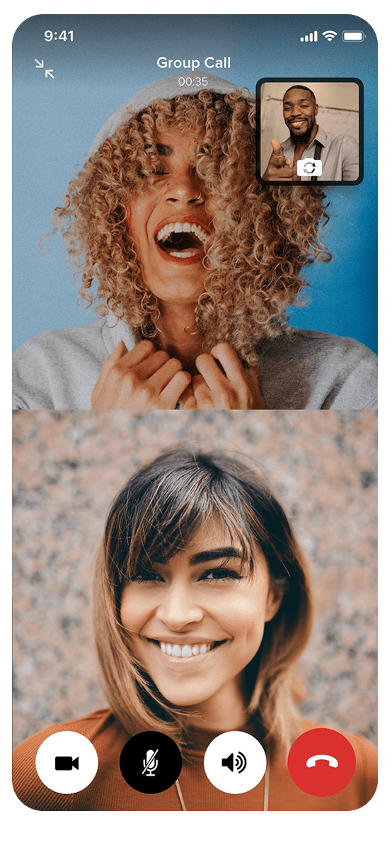
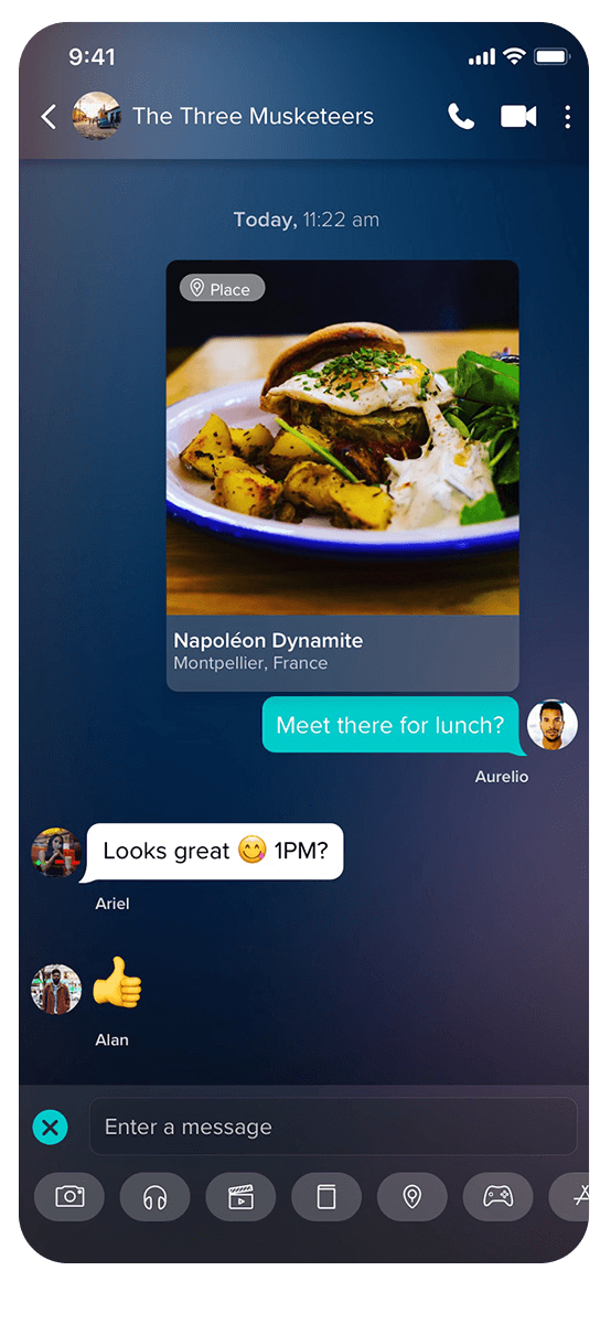
VERO 2.0 was our most significant update ever. It brings with it a lot of exciting new features like video calling, a completely overhauled Chat function and new post types like Game and App posts.
Our goals as a design team were to accommodate the new features in such a way that they were in keeping with the elegant, stripped back look of the app and avoided everything feeling crowded and to also evolve the way VERO Members navigate the app and experience the content based on what we've learned, feedback from our community and recent developments in UI and UX best practice.
A core goal for VERO 2.0 was to make it quicker and slicker to navigate to different parts of the app. A new nav bar at the bottom of the feed means you can now jump from your feed to your profile or your Collections super quickly and we've also made Chat more integrated into the social experience. As well as being able to video call Connections, you can now dive straight into your inbox from your feed by swiping left and, once you're in Chat, you can now share films, music, tv shows, books, and places with your Connections.
We've also created a new way of browsing the content shared with you - we call it VERO MidView. From your feed, tap on any post and it will float up above the feed so you can take in the full image or caption without having to expand it the caption, which is great when you want to see something in context. From there you can swipe left and right to see all the posts shared with you and when you exit MidView you rejoin your feed where you left it. This was a huge design challenge to make all the different post types from Movies to Games look the same, but the team did a phenomenal job.
The other big change (or one of them, to be more accurate), is we've added a new design option for Artists and Creators called "highlighted works" which embeds their collected works directly on their VERO profile, so if you are a musician, say, your fans can explore your discography and stream your music right from your profile. We're always working to give creators more options with which they can better represent who they are and the breadth of what they do and we hope this is a feature which will be embraced by artists and fans alike.
VERO Creator Profile example: Abi Ocia
That's the long answer. The short answer would be that our hope is that VERO Members will feel that it's easier to find what they want and go where they want to go in VERO 2.0 and that the VERO MidView helps elevate creators' content.
VERO 2.0’s design was recently recognized at the 2021 Webby Awards. What does that mean to the team?
I feel there is much gratification, satisfaction, and motivation by having received this award. It’s really proof of success through determination and persistency – arguments, laughter and full-time joy, in the endless drive towards challenging the rules and creating something great and with value.
What's your favorite VERO Feature?
The audience selector. It's at the core of what we do - you, as a VERO Member, decide who sees what you post. (It also took a huge amount of time to get it right!)
VERO Audience Selector
What do you look for in a designer?
We are fortunate at VERO to have a phenomenally talented team, drawn from a variety of creative disciplines and backgrounds. Beyond talent and grit (required of anyone working at a startup), I look for people who, whilst passionate about their own design and original contributions, also recognize that we are all working together towards a common goal, so collaboration is key, not just with each other but with the engineers who translate everything into something tangible - we would be nowhere without collaboration.
We hear you are quite handy at martial arts.* Is there anything about the practice of martial arts that informs your creative work?
Martial arts has taught me the importance of staying the course, following through all the way, and illuminated the truth that progress is often incremental. I try to focus on that - getting a little better each day - and also remembering that core to Tae Kwon Do when you reach a certain level, is in helping others and bringing them up...
* Alistair is a 2nd Degree Black Belt in Tae Kwon Do at Master Park Moon Soo & Master ElKellali Aziz


Road to Belonging